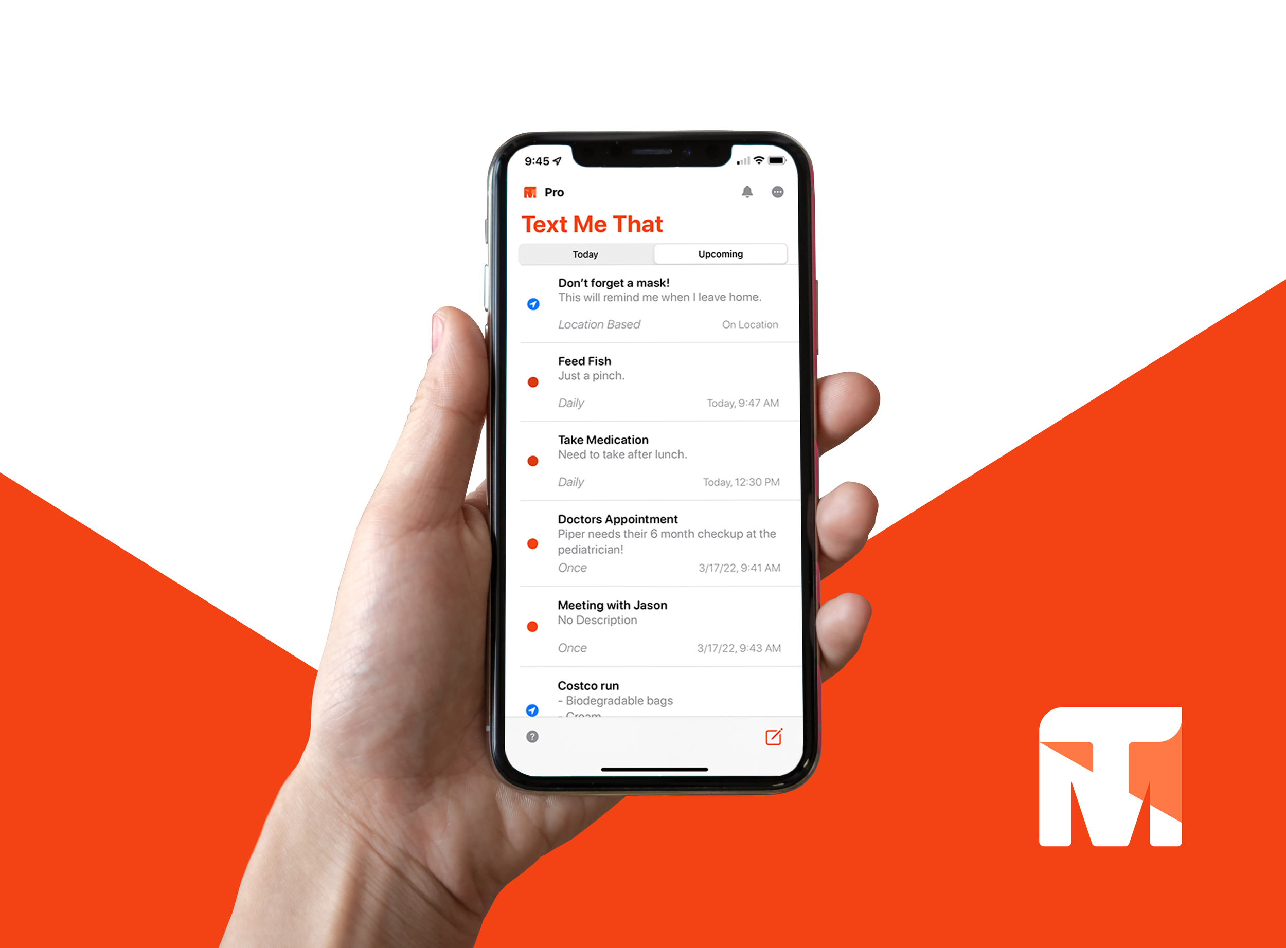
Text Me That
An iOS application designed to cut through the noise of everyday life. With location-based, group, and scheduled reminders, this app sends timely texts to you—and others—to ensure nothing slips through the cracks.
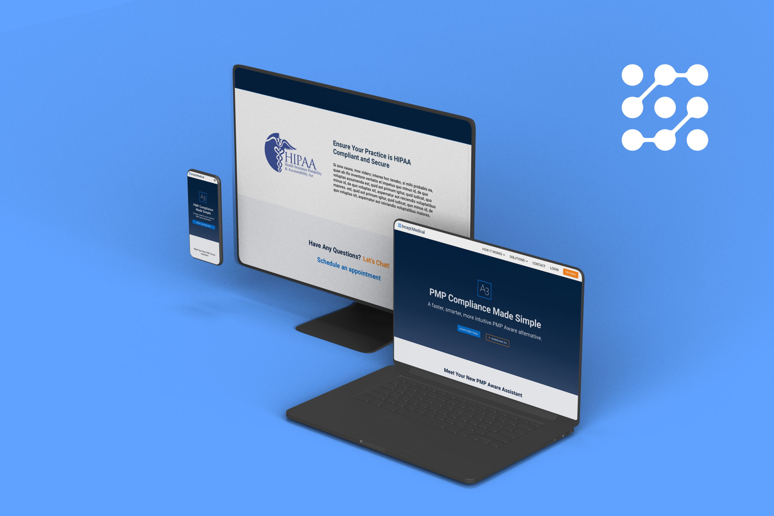
Private Developer
Client
Role
UX Research & UI Design
Tools
Adobe XD, Zeplin, Firebase, Illustrator, Photoshop
Background
Text Me That began as a simple text-message reminder app but needed a comprehensive UX overhaul to stand out among the sea of push notification–based tools. Users often ignored or missed alerts buried by other apps—something text messages could solve by demanding more immediate attention. With an existing small user base, the project aimed to leverage text-based reminders to ensure critical tasks never fell through the cracks.
What is Text Me That?
Text Me That is an iOS application that allows you to schedule text-message reminders for yourself or others. Unlike standard notification apps, Text Me That uses SMS to break through notification clutter. Whether it’s sending a location-based reminder to a friend or scheduling group alerts for a project team, Text Me That helps busy individuals stay on top of their tasks in a more reliable, attention-grabbing way.
The Problem
Despite having a unique reminder mechanism, the initial version of Text Me That struggled to retain and grow its user base. Key challenges included:
Lack of Clarity: Users found the interface confusing, making it difficult to set up recurring or location-based reminders.
Limited Feature Set: There was no simple way to send group reminders or track multiple reminders for different tasks.
As a result, user adoption stalled, and many potential users reverted to traditional (yet less effective) reminder solutions.
The Goal
Our primary goal was to refine Text Me That’s user experience, feature set, and brand identity so it could stand out in the reminder-app market. Specifically, we aimed to:
Enhance the UI/UX to make scheduling and managing text reminders more intuitive.
Introduce new capabilities such as location-based prompts and group messaging to broaden use cases.
Increase user engagement through clearer onboarding and consistent branding.
This would position Text Me That as a self-sustaining product that effectively solved a real pain point: ensuring critical to-dos and reminders aren’t lost in the daily notification flood.
Why wait?

If you want to jump straight to it, you can try Text Me That in the wild. It is a fully launched iOS application.
Research and Defining the Solution
Early-stage research involved user surveys and competitive analysis to pinpoint what set Text Me That apart and where it needed improvement. Key findings included:
Notification Overload: Standard push notifications were too easy for users to overlook.
Sharing Challenges: Many apps didn’t offer a simple method for sending reminders to friends or family.
Text Messages Felt Urgent: Users consistently rated SMS reminders as more immediate and important.
These insights led us to focus on four pillars:
Location-based reminders
Flexible scheduling (one-time, recurring, or location-based)
Group messaging
Accessible, simple UI
We could differentiate Text Me That from other reminder apps by addressing these core areas.
Approach & Ideation
User Interviews: We spoke with busy professionals, students, and parents to gather input on crucial reminder features.
Feature Prioritization: Group reminders and location triggers emerged as highly requested functions and potential areas to grow Text Me That’s value.
Competitive Analysis: We compared other text-reminder apps and noted common UX pitfalls—especially clunky interfaces and confusing onboarding.
Prototyping & User Testing
Low-Fidelity Wireframes: Early sketches helped us map essential flows: creating reminders, scheduling texts, and managing contacts.
High-Fidelity Prototypes: Using a vibrant yet minimal design, we introduced an orange brand color and intuitive layouts to highlight the text-based approach.
User Feedback: Testers found the concept of SMS reminders compelling but wanted clearer scheduling tools and easier group texting options.
Refinement & Collaboration
Streamlined Scheduling: We consolidated date/time pickers, recurrence settings, and location triggers into a single, straightforward flow.
Logo & Branding: The orange-and-white aesthetic was refined to maintain a cohesive identity across all screens.
Technical Integrations: Working closely with the developer, we integrated Firebase to handle user data and real-time updates seamlessly.
Sketches + Wireframes
These initial drawings outlined simple column/row layouts for the reminder dashboard to keep content scannable. As we progressed, wireframes became more detailed—defining how users would create, edit, and share reminders without getting lost in sub-menus. Early feedback from testers and stakeholders ensured we kept the design lean and user-friendly.
Design Highlights
Text Me That’s design was carefully curated to cut through digital clutter with a clean and approachable interface:
Bold, Simple UI: Dominant orange accents to emphasize actionable elements and convey a friendly, energetic tone.
Clear Typography & Icons: Rounded fonts, easily recognizable icons, and spaced layouts to reduce cognitive load.
Consistent Design System: Uniform color palettes, button styles, and input fields for a seamless user journey.
End-to-End Mobile Application
Following several design iterations, Text Me That evolved into a fully featured iOS application capable of:
Recurring & One-Time SMS Reminders: Users can schedule daily, weekly, or monthly texts.
Group Messaging: Easily send text updates to multiple contacts with a single tap.
Location-Based Triggers: Texts fire off when users enter or leave designated areas.
Performance Optimization: Continuous efforts to ensure fast loading times and reliable SMS delivery.
Reminder Features
Product Page
Onboarding
Testing and Iteration
Key Testing Insights
User Adoption: Testers embraced text-based notifications, saying they “couldn’t miss an SMS the way they missed app notifications.”
Complex Scheduling: Some users hesitated to use advanced features like location triggers until we streamlined the permission prompts and setup steps.
Navigation Improvements: Early testers suggested more prominent icons and simpler naming to clarify each menu’s function.
From Feedback to Functionality
Menu Flow: Reduced the steps needed to create a reminder by unifying date/time and location settings.
Accessibility Features: Implemented higher contrast text, larger touch targets, and optional voice-over guidance.
Subscription Model: Added a PRO tier for power users who want unlimited group reminders and more frequent triggers.
Next Steps
Complete Beta Testing & Launch: Collect wider feedback and refine the UX based on real-world usage.
Expand to Android: Broaden market reach and maintain feature parity across platforms.
Advanced Integrations: Explore integration with calendars, wearable devices, and voice assistants.
Marketing & User Growth: Highlight the app’s unique text-based reminders to attract a broader user base.
Lessons Learned
Throughout the evolution of Text Me That, the team gained valuable takeaways:
Text Reminders Drive Engagement: SMS-based alerts consistently outperformed standard push notifications in terms of visibility and user action.
Simplify Complex Features: Streamlining scheduling, location triggers, and group texting proved essential for adoption.
Transparency Builds Trust: Clear explanations around location usage and data collection reduce barriers to use..
This concludes the case study for the mobile application Text Me That. Feel free to download it for yourself and try out the finished product out.